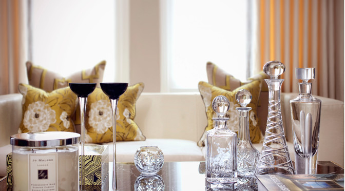
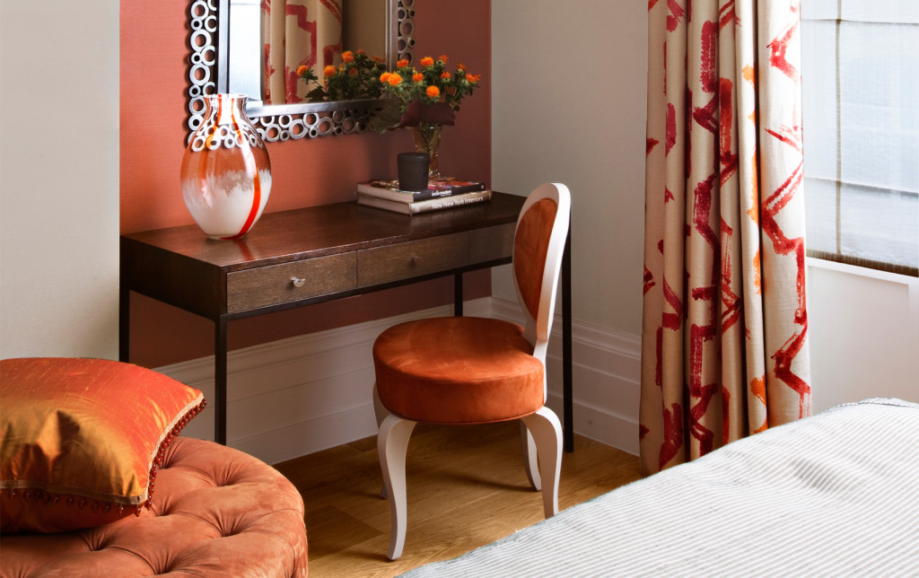
Colour surrounds us everywhere we go in our daily lives. However, having an eye for which hues work in a room or setting versus knowing those that don’t work, is not always obvious to everyone. Why do we choose certain colours over others? It is a very personal thing and not everyone sees colour in the same way. The use of colour with residential interior design is a fundamental element that can be the basis for starting a project or design scheme. Choosing a shade to use in a home can be a daunting task when you think about the many options to choose from and the impact colour has on our psyche. It is well documented how colour can impact our mood, body and mind. For example, some tints are seen as warm and stimulating due to personal or universal associations. Orange, red and yellow are often associated with fire, heat and the sun. On the opposite end of the spectrum, tones seen as cool and calm are often those associated with the ocean or the sky. These green and blue colours are often referred to as having low-arousal hues. With so many colours and varying shades to choose from, it can be tricky when creating a palette for a residential luxury interior design project. The varying shades of a colour, its darkness or lightness or even its luminescence, can alter the emotional feeling. Imagine the various shades of blue. A light bluish-green may seem tranquil and calming while a vibrant teal may be associated with a jungle or seaside, thus transferring a feeling of excitement. The emotional feeling can be more impacting than the visual perception in many instances.
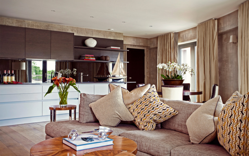
Once a hue is selected, it is equally important to consider the use of ‘colour harmony’ as various textiles, wood, furniture and stone are incorporated into the design. The intelligent balance of colour, textures and finishes will greatly impact the success of a residential interior design scheme. A well-coordinated design scheme will not only transform the room’s beauty and aesthetics, but it will also convey the appropriate feeling or emotion for that environment. It is important to remember that colour is derived from the spectrum of light as it interacts with the eye. A rainbow is a perfect example of how all colours of the spectrum are present in white light. As light is the transfer of energy, this energy will subsequently influence our mood or psyche. This science of colour is oftentimes referred to as chromatics, or more simply, colour science. Certain colours can be irritating for the eye, cause headaches, or even impact our vision. This effect is often referred to as ‘colour fatiguing’, as the optic nerve receives excessive stimulation. One of the worst offenders is yellow. This is because more light is reflected by bright colours, thus, resulting in greater stimulation to the eye. Although yellow is considered a cheerful colour and is known to enhance concentration, it has been suggested that people argue and babies cry more often in yellow rooms due to overuse of the colour. On the other hand, as yellow is the most visible of all colours and more likely to be the first a human eye notices, it can be very useful when incorporated as an accent.
Various residential luxury interior designers now use chromotherapy, sometimes called ‘colour therapy’, when designing luxury bathrooms, spas and hamams. There are numerous chromotherapists who claim that light in the form of colour can be used to balance ‘energy’ throughout a person’s body, whether it is physical, emotional, or mental levels. An example of this is the installation of hydrochromotherapy systems as part of your residential interior design, which can allow a person to shower under various different colour selections based on a mood setting. Does this exposure to coloured lights really improve your health or mood? Not everyone in the scientific community agrees. But, even if you don’t believe in colour therapy, there is something to be said for relaxing in a setting with beautiful lights and colour.
See how interior architect Rene Dekker uses colour in various projects.
Learn more about the use of Colour in Interior Design and find out what the Colour of the Year is for 2019.