There's a well-known phrase in the fashion industry: “Blue and green should never be seen,” together, that is. Well, nowadays that would be considered old-fashioned and de rigueur. In today's interior designer circles, there are very few rules when it comes to incorporating colour in interior design, it all depends on how you use them.
There are however, a few constants to do with colour theory. Research has shown for example, that cultural differences can make us respond in different ways, but the overriding and universal agreement, is that one way or another colour is important to us all.
Whether you love (or possibly fear) the use of colour, there are several ways to incorporate it effectively to create the perfect luxury interior design scheme. Natural tones can make a space feel light and fresh; soft shades can create a calm and tranquil mood; bright, primary hues will bring a space to life; while a dark scheme will evoke a hint of sensuality. But whatever the approach, the ultimate goal is one of unity.
The ways of incorporating colour is frankly, immeasurable, which is where an experienced, luxury interior designer can step in and transform a space. Not only should a design professional know how colour works, they should also be able to interpret the needs and personality of the owner, which is often a skill in itself, as well as potentially implement the color trends of the time.
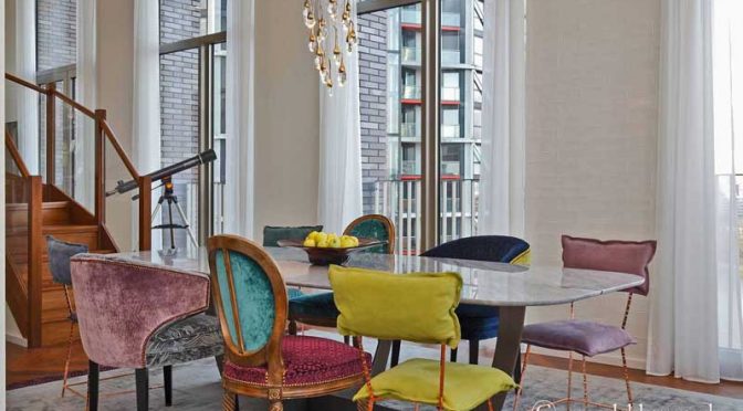
Today's perceived wisdom for many is to create a room scheme that comprises a neutral background with pops of colour interest. One hue can be used as a visual thread throughout a room or indeed a whole property – splashes of a bright aqua or turquoise can be repeated throughout the furnishings and accessories for example, to a greater or lesser degree. A sofa in the same shade as a window treatment would repeat the theme solidly, while the trim of a scatter cushion teamed with a lampshade act as a subtle reminder, but still unifying a room's composition.
Meanwhile, matching the tone of the colour in a pattern floor rug to the seat of an ottoman, and then to a specific hue in an artwork on a wall not only lifts the feel of a space, but draws the eye around the room so it's appreciated as a whole.
In the hands of an experienced, top interior designer, colour can create mood as well as movement. Much like planning a painting, when colour in a design scheme jumps from high-key to low-key tones, or when pure hues as well as tints are put together, a feeling of excitement is created.
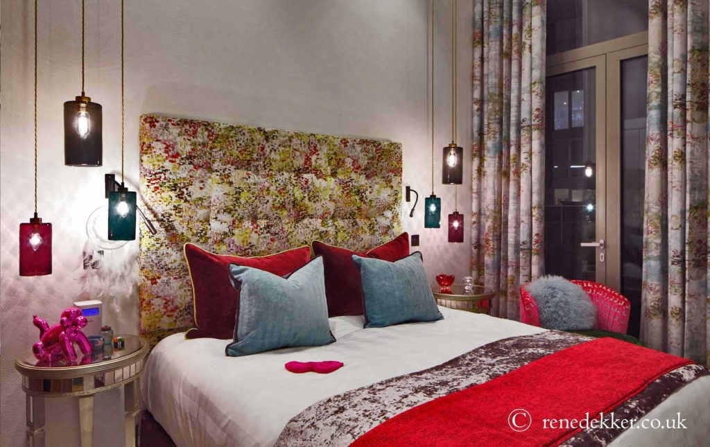
Many colours contain both warm and cool varieties, so depending on the atmosphere required, it's important to choose carefully. Blues for example are much warmer with a red base, and cooler when leaning towards the green spectrum. The general rule here is to ensure that if using different hues ensure they all contain the same tonal value as each other, therefore creating a sense of cohesion, despite their differences in hue.
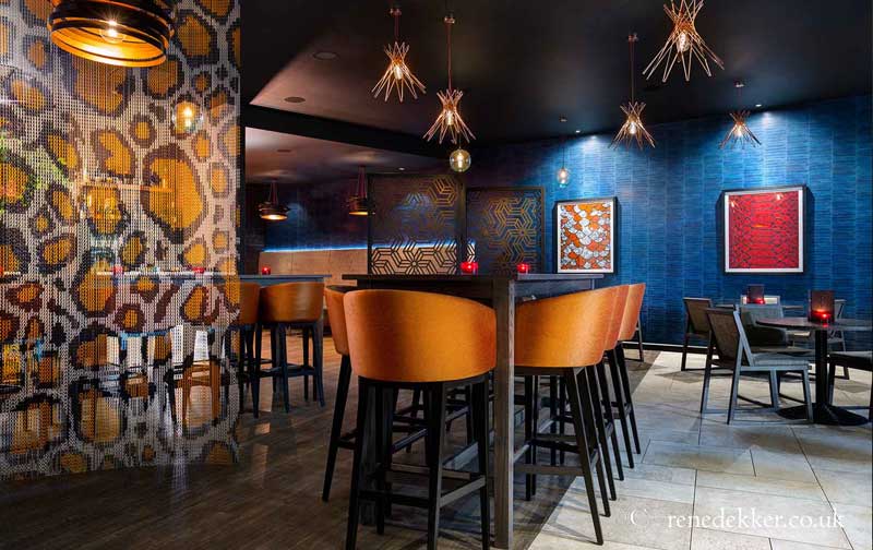
In addition, complementary shades (those directly opposite each other on the colour wheel), sit happily together. This can be seen particularly well in room scheme with classic blue tones where a fresh teal can be matched with warm shades of russet and natural wood. Taking the same theme but in a slightly different, stronger direction, a rich indigo is the perfect partner for delicious shades of chocolate.
Sometimes, however, there's no logical understanding as to why a certain interior design scheme works. The analysis of colour can help understand most coordinating fundamentals, but there's one element that can't be explained — why designs are successful, when they absolutely shouldn't be. As Pablo Picasso once asked: “Why do two colours, put one next to the other, sing? Can one really explain this?”
The answer lies in the hands of an artist or designer, and their instinct. It is this unique element that can make the difference between a competent scheme and one this is truly stunning, and it's worthy of only the best designers.