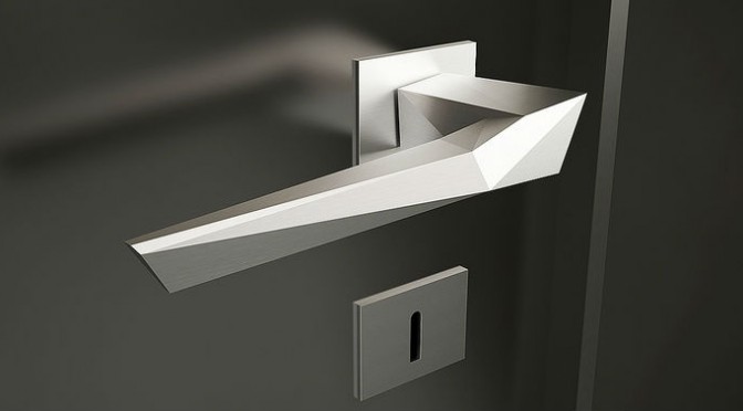
In the second part of our Knobs and Knockers blog, we look at the furnishing for your front door, including your door knob design. Double entendres aside, there's a huge array of designs out there, from fun to functional knockers, letter plates, letterboxes, door bells and escutcheons. So, where do you start?
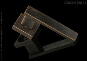
image courtesy of Joseph Giles
Whether you have a period property, a contemporary home, conversion or a development, what you put on your front door is your calling card. Door design is a fun way to showcase luxury interior design and is the first impression for guests. Although some homeowners will want items that are purely practical, others will crave a design that expresses their personality, interest or hobby.
Colour surrounds us everywhere we go in our daily lives. However, having an eye for which hues work in a room or setting versus knowing those that don’t work, is not always obvious to everyone. Why do we choose certain colours over others? It is a very personal thing and not everyone sees colour in the same way. The use of colour with residential interior design is a fundamental element that can be the basis for starting a project or design scheme. Choosing a shade to use in a home can be a daunting task when you think about the many options to choose from and the impact colour has on our psyche. It is well documented how colour can impact our mood, body and mind. For example, some tints are seen as warm and stimulating due to personal or universal associations. Orange, red and yellow are often associated with fire, heat and the sun. On the opposite end of the spectrum, tones seen as cool and calm are often those associated with the ocean or the sky. These green and blue colours are often referred to as having low-arousal hues. With so many colours and varying shades to choose from, it can be tricky when creating a palette for a residential luxury interior designproject. The varying shades of a colour, its darkness or lightness or even its luminescence, can alter the emotional feeling. Imagine the various shades of blue. A light bluish-green may seem tranquil and calming while a vibrant teal may be associated with a jungle or seaside, thus transferring a feeling of excitement. The emotional feeling can be more impacting than the visual perception in many instances.