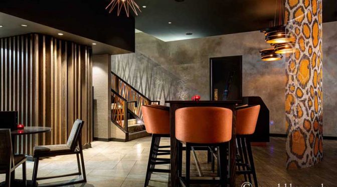
Trend-setting luxury interior designer and interior architectRene Dekker is known around the world in the interiors industry for his uncompromising attention to detail, and his impeccable sense of quality and luxury. "I wouldn't say I have a signature style, but three words that describe my work would be: considered, tailored, refreshing. We don't have a House Style so I think potential clients understand that we can give them what they think they want. On top of this we are creative, efficient and organised, which is what clients should expect."
René admits that although every job is different, there are some constants that he adheres to regardless of the scale or requirements of the project. "I've worked on a variety of schemes around the world in China, Russia, South Africa, USA, Europe and here in the UK. These include residential apartments to luxury homes and yachts, to commercial interior design work such as hotels, spas and restaurants. But the one thing I do for every project I undertake is to follow the same procedure from start to finish with integrity."
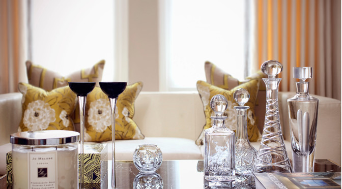
Colour surrounds us everywhere we go in our daily lives. However, having an eye for which hues work in a room or setting versus knowing those that don’t work, is not always obvious to everyone. Why do we choose certain colours over others? It is a very personal thing and not everyone sees colour in the same way. The use of colour with residential interior design is a fundamental element that can be the basis for starting a project or design scheme. Choosing a shade to use in a home can be a daunting task when you think about the many options to choose from and the impact colour has on our psyche. It is well documented how colour can impact our mood, body and mind. For example, some tints are seen as warm and stimulating due to personal or universal associations. Orange, red and yellow are often associated with fire, heat and the sun. On the opposite end of the spectrum, tones seen as cool and calm are often those associated with the ocean or the sky. These green and blue colours are often referred to as having low-arousal hues. With so many colours and varying shades to choose from, it can be tricky when creating a palette for a residential luxury interior designproject. The varying shades of a colour, its darkness or lightness or even its luminescence, can alter the emotional feeling. Imagine the various shades of blue. A light bluish-green may seem tranquil and calming while a vibrant teal may be associated with a jungle or seaside, thus transferring a feeling of excitement. The emotional feeling can be more impacting than the visual perception in many instances.