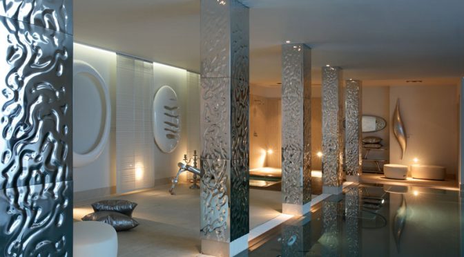
Our homes, more than anywhere else, should act as sanctuaries from noise, people, commotion and the general hustle and bustle of the outside world. They should be a place to which we can retreat in peace, to surroundings of harmony and tranquillity. They should be somewhere that, whatever our own personal tastes, we find a pleasure in which to spend time to relax, entertain and most of all, enjoy.
In this day and age there is a strong emphasis on the way we live our lives in terms of technology. This can take the form of a home cinema, top of the range sound system, up-to-the-minute kitchen gadgets, evolving artificial intelligence, phones and laptops or the seemingly unbreakable habit of tapping onto our social media platforms. So, it’s interesting to hear that there’s actually been a bit of a backlash to the onslaught of technology in our own environment in an unexpected form – colour.
This summer, the hot topic in interiors is the fact that experts at the Pantone Colour Institute have declared Living Coral their colour of 2019. According to research in the field, this shade is fast replacing pink as the latest popular accent hue, and the choice apparently, is a direct reaction to the fight against modern technology and social media.
In an attempt to encourage people to participate in real human interaction and experience, this hue has been chosen to act as a reminder to introduce some natural surroundings into our lives, evoking the vibrant reefs from which it takes its name.
But, coral is a difficult colour to incorporate and it takes an expert and seasoned interior designer to be able to balance a scheme using this hue. Looking at the ranges on its palette it has touches of pink, orange, terracotta as well as red, so as well as been a bit tricksy, the flipside is, it has versatile properties.
It can be used in many schemes in many different ways. When looking at the psychology of colour, this shade and its close neighbours support creative energies and optimism. It is also considered a warm and inviting colour that is both physically and mentally stimulating.
Neither too strong nor insipid, but somewhere in the middle, coral is described as a shade that embodies our desire for playful expression and welcomes a light-hearted atmosphere. With its golden undertone creating a comforting warmth and subtle hint of the outside world, this vibrant yet mellow hue is the perfect shade to introduce into any interior design scheme.
On a larger scale, and with its much talked about ability to encourage social communication and real-life two-way conversation, it would very much suit a dining room. But it can also act as a wonderful background to accessories in equally rich hues of the same tone, so complementary blue, its natural watery partner, will make a scheme sing.
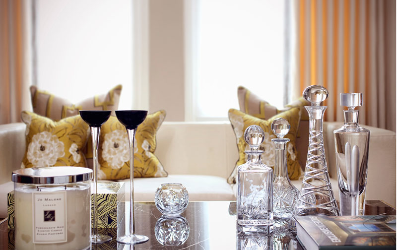
If a smaller statement is required, splashes of coral in a wallpaper design or curtain fabric will enliven an area with a touch of considered sophistication.
Used as an accent, coral can be included in accessories such as scatter cushions, rugs and throws, which will help keep a scheme looking lively but without feeling too overdone. Meanwhile details such as flowers in shades of coral among touches of greenery add vibrancy and freshness to a scheme.
The world of home cinemas, robot design and colonising Mars haven’t exactly been usurped by the colour coral, but it’s nice to know that the characteristics that make us all human have been given a little bit of air time for a change.
As Leatrice Eiseman, Executive Director of the Pantone Colour Institute said: "Colour is an equalising lens through which we experience our natural and digital realities and this is particularly true for Living Coral. With consumers craving human interaction and social connection, the humanising and heartening qualities displayed by the convivial Pantone Living Coral hit a responsive chord.”