There is an ancient philosophy with colour at its core that has lasted the test of time. Some might scoff at the idea, although it seemed to work for the Egyptians and Indians, of colour containing healing powers. But chromo therapy (the effect of colour on health and behaviour) is very much used in environmental design today. But it takes a particular skill to coordinate a monochromatic scheme that doesn't look disastrously dated or worse, devastatingly dreary.
1 Keeping in neutral
As general rule of thumb, neutral colours (or greys as they're more commonly known) contain equal parts of each of black, white, or interestingly brown (which is also considered to belong to the neutral family). When all of the values of the same colour in different light/dark tones are used close together the overall effect is one of a calm, serene feel.
2 Tonal greys
There's more to grey and its shades today, than one would ever have thought possible. Look at any quality paint chart and an array of greys abounds with names like Plummet, Downpipe and Blackened. Despite the slightly unfortunate names, however, grey is a versatile colour that can create different moods: warm, yellow based greys to act as neutral foil; cool, blue-based greys to give a hardy, industrial feel; green greys for a more natural look, and even pink greys for a classic, stately home touch of elegance.
3 A matter of balance
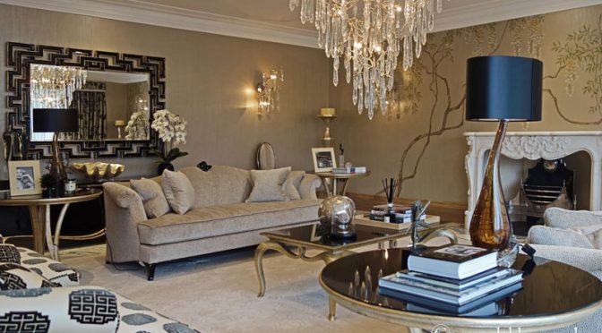
A high-end interior designer will be able to use this colour in various ways: one tone, but in different values and intensity throughout a space. In his Chigwell project, top interior designer René Dekker has selected a base shade of grey and taupe, and chosen variations on either side of this (both lighter and darker), to add interest.
In the sitting room, the dominant mid-shade is used in the carpeting, walls and furnishings, grounding the scheme. Meanwhile darker tones are introduced through the mirror frame and lamp shade, while paler shades of the same hue are seen in the fireplace. This prevents the scheme from looking too similar, with pops of coordinating and complementary shades creating focal points.
4 Reflections
To break up the monochrome look further, reflective glass in larger pieces such as the mirrors and a dining table are used. This theme is then repeated in smaller details such as the chandelier droplets and drawer knobs for a sense of freshness as well as continuity.
5 Metallics
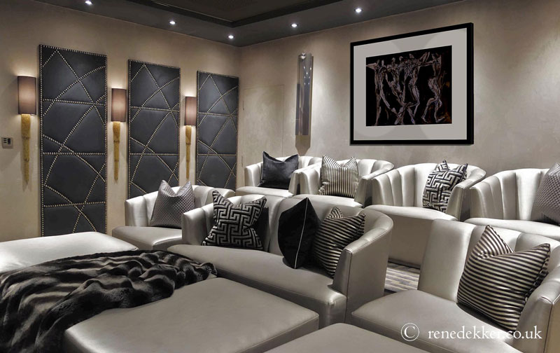
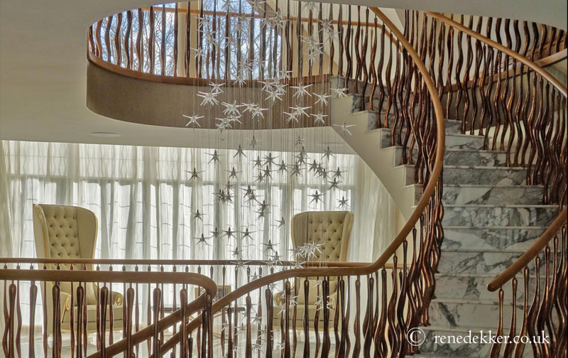
To prevent a scheme from looking too “soft” metallics have also been used to add that all important element of glamour. This is seen particularly in the cinema room, where even the furnishing fabric and the scatter cushions have an element of sheen. Metal studs in the doors also add a touch of shine to help enliven the overall feel. Meanwhile in the hall the fabulous balustrade in elegant copper tones hugs the marble steps on the main stairs, while a veritable meteor shower of crystals cascade through the centre — fit for a film star, but still in keeping with the tonal values of the property as a whole.
6 Patterns of behaviour
Marble is a substantial yet surprisingly unobtrusive way of introducing pattern to a grey scheme, both on the walls and floors, particularly in a bathroom, as well on surfaces in a kitchen. Its unique qualities provide an instant injection of glamour.
7 All in the detail
In addition, using a clever technique, René has also focussed on pattern to draw the eye away from the simplicity of neutrals and focus on a particular detail – the design of the wallpaper in the sitting for example does this to perfection.
So in this day when the colour grey has made a comeback, whether it's to create a new version of industrial chic, a neutral background for pops of additional colour or a scene of calm and serenity, grey and all its 50 shades looks here to stay. As Christian Dior once said, “The tones of grey…will prevail.”