Coral and its close relation, orange, is often seen as a hue that offers emotional strength in difficult times, an optimistic and uplifting colour that can rejuvenate our spirit and mood.
Sandwiched between vibrancy and pastel shades, its enthusiasm for life relates to physical confidence, competition and independence. In its strongest form coral is seen as an extrovert shade, but knowing how to use it successfully is a skill a top interior designer will have mastered.
The beauty of coral is that it is a surprisingly versatile hue when it comes to pairing it with other shades and materials. It’s not as strong as an obvious orange or as pale as a pretty pink, but somewhere in between.
Coral can also be used as an accent, in all its forms, from anything from neon to pastel. But it also has a classic vintage feel, and in the hands of an experienced interior designer can even be given a contemporary twist.
In addition, it benefits from being associated closely to the natural world, particularly the sea. In its original habitat, coral’s environmental partner is water, so teaming it with varying and complementary shades of blue is the perfect way to create a harmonious interiors scheme.
As opposites on the colour wheel, these two hues are natural bedfellows and can be used to a larger or lesser degree to create a lively but not overwhelming feel. Aqua, cornflower, light blue, turquoise and teal all work with varying tones of coral to create an exciting combination and sense of movement. The pairing suggests freshness, gives a feeling of energy and, if evoking the watery scene from which it originates, can also be seen as mentally relaxing.
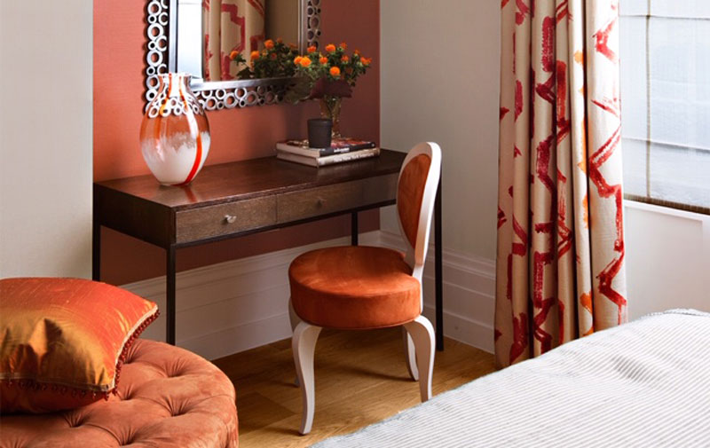
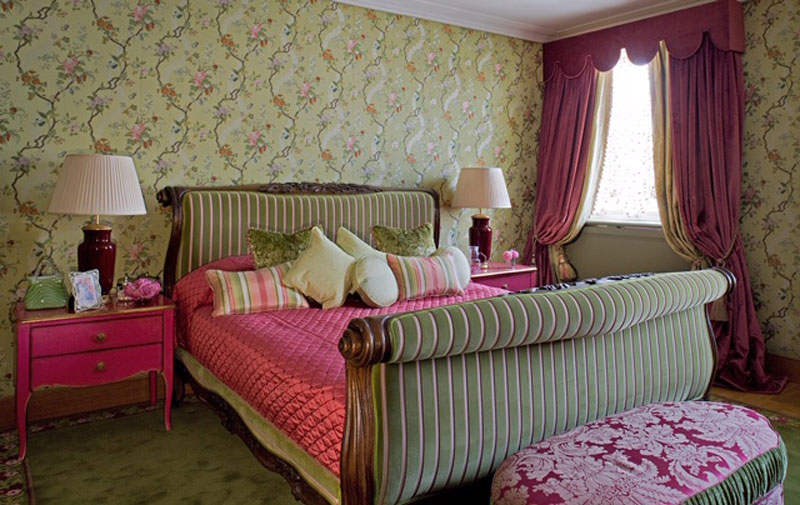
One of the boldest ways to incorporate coral into a scheme is to use it as a backdrop for accessories. It is also beautiful when teamed with other organic colours such as olive green and mint evoking a less aquatic and more rural feel. To continue this theme, when matched with earthy hues such as russet, ecru, burnt umber, mustard, and yellow, it creates a mellow and calming atmosphere.
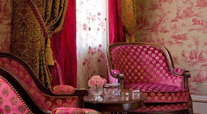
Since coral has a golden undertone, it perfectly complements either brushed or shiny gold touches such as accessories including lamp bases or mirrors, or even a metallic element within fabric. This is also a great way to emphasise the colour and really bring it to life.
For a more modern look, coral against on-trend inky, black or navy walls can create a beautiful faux-neon look. With the addition of graphic patterns or black and white stripes for example, the result is a cutting edge contemporary interior scheme.
Meanwhile, the pairing with foundation colours such as white, light grey or beige is also particularly effective as they blend seamlessly together, while coral touches of freshness and pops of colour to add interest. Taking this a step further, when teamed with a surface such as marble or a warm wooden floor, this colour used in an effervescent tone, can be persuaded into high-end luxury design.
Used to accessorise, it can be the element that gives the final touch of sophistication to a neutral interior. A detail in fabric such as a curtain, a rug, throw or decorative accessories such as lampshades, can make that all-important difference.
Coral emits energising aspects of colour found in nature, and leaving its colour aside, elements of real coral, whether as a design motif or the actual sculptural shape can make a striking addition to a room scheme.
“We are tied to the ocean. And when we go back to the sea, whether it is to sail or to watch – we are going back from whence we came.” John F Kennedy.