There's no other way to say this, teal is a stunning colour. It's blue with personality — a sophisticated and versatile hue that complements so many other shades to create a stunning interior design.
Its name is believed to have been taken from the small freshwater common teal duck whose eyes are surrounded by this colour. The hue itself is a medium-saturated, blue-green, and similar to medium green and dark cyan. At its brightest it has a yellow undertone and is very close to turquoise, and at its most muted, it more closely resembles a green slate.
It's a classic tone that works with nearly any style, from eclectic to traditional, maybe because it can be both punchy and loud and muted and quiet, depending on what is required. Though most home owners feel that teal is relegated to a vintage or cottage-styled look, it is a perfect fit for the sleek contemporary homes as well.
With its jewel blue base it can radiate a sense of peace, calm and tranquillity, while the small amount of yellow it contains, creates a balance to suggest an uplifting sense of growth and energy. Once called fallen sky stone some believed it had an ability to ward off evil and offer health — either way, the colour has been embraced by cultures across the world as one that energizes interiors while providing pleasure and serenity.
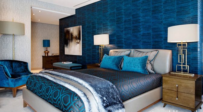
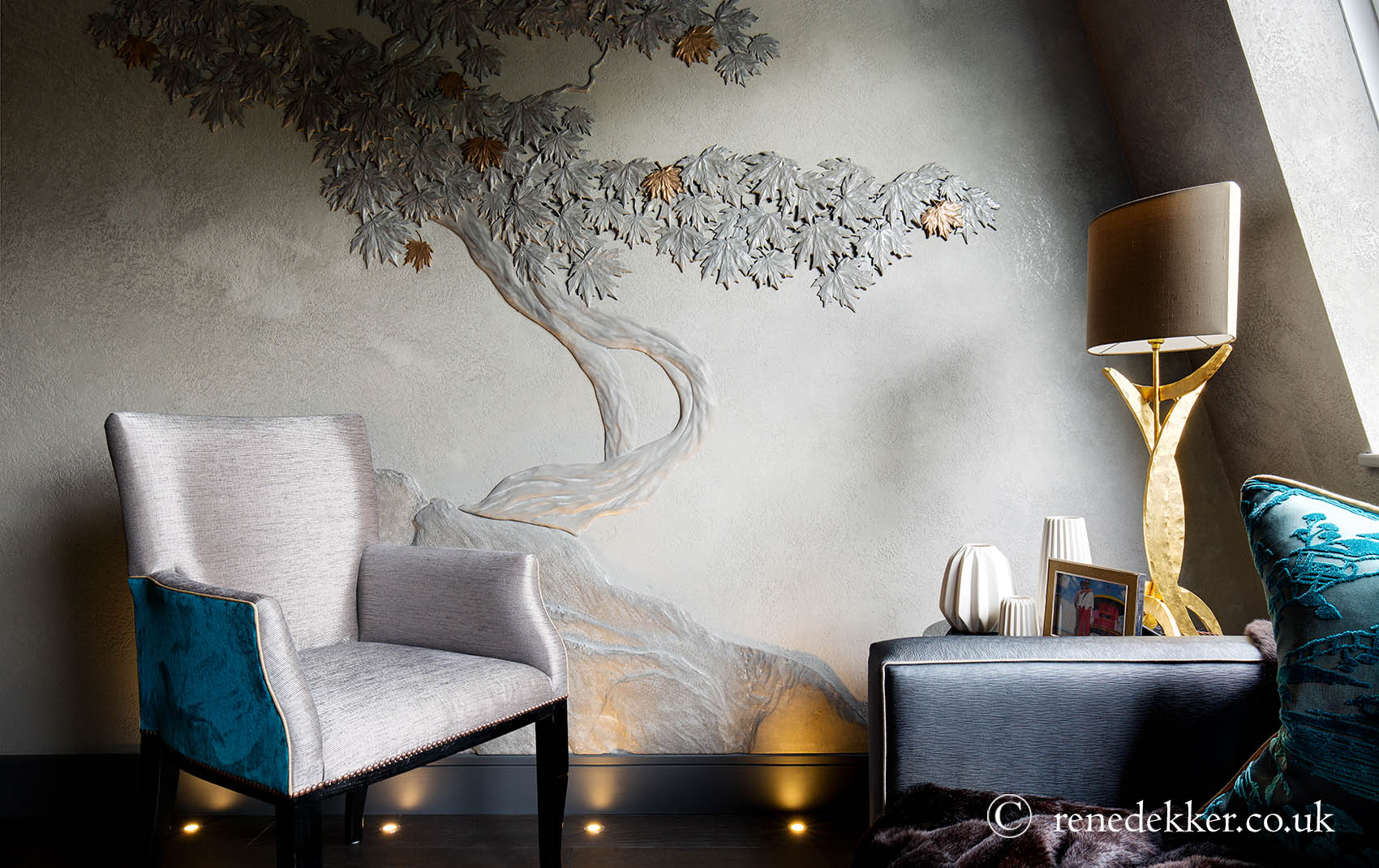
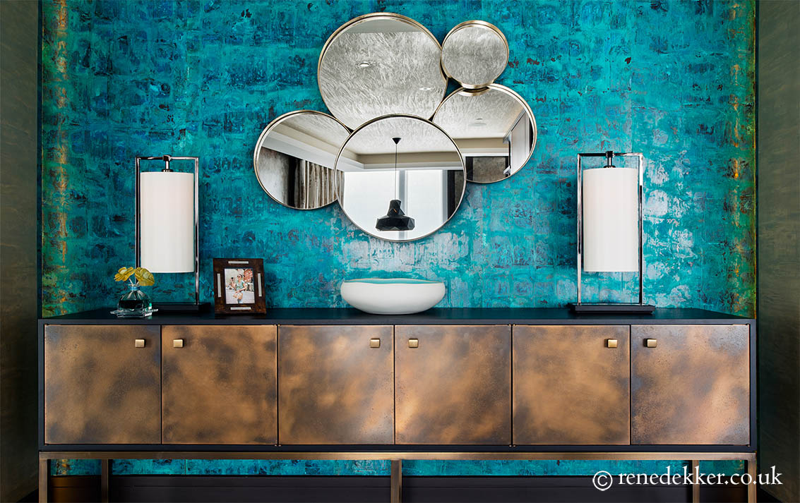
Luxury interior designer René Dekker has incorporated the colour to fabulous effect in his stunning interior schemes.
TOP 9 TIPS
1 The allure of teal, and its first cousin turquoise, is often attributed to their association with the colours of the sea. Many people love the emotions this image conjures up with its bright, light sense of space and want to recreate this is in their home. The best way to achieve this is to team the shade with white, bearing in mind that the more pristine the background, the more stark will be the effect of the colour used.
2 To make teal stand out as the star of the room but in a softer environment, choose a neutral palette using a medium grey or natural tones, or alternatively, use a paler version of the colour to cool down the contrast.
3 Teal's complementary hue, and opposite number on the colour wheel, is coral. When put together, the pairing of opposites can create a bold and dramatic look, which can be dazzling.
4 Teamed with sharp yellow and citrus shades such as lime green, the hue will instantly be given a zingier, contemporary feel.
5 Teal can be a rich, bold hue and is often used as an accent. Using a bright and bold accent colour with elegance is all about balance – repeating it in several places through accessories including pillows, vases and glassware all help create that sense of harmony.
6 A colour that was popular in the mid-century, teal can be combined with earthy, gold tones and light browns for a vintage look.
7 Hues next to each other on the colour wheel are called analogous, and create a relaxed feel to a scheme. Teal's analogous neighbours are varying shades of blue and green, and even purple-blues and yellow-greens. A simple combination of various tones of the colour can result in an engaging look.
8 Used on the ceiling, the teal will lower the sense of height in a room, and can act as a background from which to highlight ceiling features such as cornicing, ceiling roses, or beams.
9 In terms of the psychology of colour, it has been said that teal is considered to aid communication and clarity of thought. It's thought to be a hue that recharges the spirits during times of mental stress and tiredness, alleviating feelings of loneliness. Many believe it can calm the nervous system, build confidence and heighten levels of creativity and sensitivity, and is even the chosen choice for public speaking venues.