Close


Everyone in London knows the iconic black and white ‘pony skin’ décor which has graced this leisure landmark for nearly 30 years, but even Icons need to keep up with the times. In recent years, through the ever changing fortunes and dips in the economy, even the stalwarts were affected and Gauchos was no exception. Our client, Martin Williams, also the CEO of M Restaurants, had a personal interest in reviving Gaucho’s fortunes, having previously headed up the chain for many years and it was through our long standing relationship with him, that top London interior design studio, René Dekker Design was invited to be part of a small team of design companies, involved in bringing this landmark restaurant chain into the 21st century.
We were given the task of transforming this Flagship restaurant (over 3 floors) into a modern day Argentinian eatery. Our vision was to emulate the iconic pony skin theme and use this in a more understated fashion, thus retaining the visual memory but reducing the overwhelming use in the decoration. Whilst it would always be a steak restaurant, Gaucho also wanted to move with the times and offer meat alternatives on the menu so had to appeal to all sectors of the public.
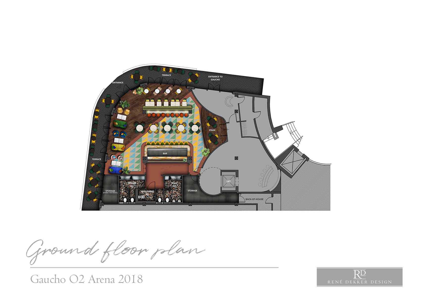
Starting on the ground floor we removed all the black-out from the windows giving the space some kerb appeal. We created two levels to match what the original space had (most of the services were under a raised floor) and tried to keep the back of house and toilets located roughly in the same areas. This would save money and time considering this was a fully functional venue. In terms of styling, we wanted to provide a fresh and almost tropical feel without losing the corporate identity. Our plan was to use some bright colours, ‘rusty’ services pipes, exposed brick work and sub-tropical planting. We also created a holding bar around the lift for spill over diners waiting to be seated. The existing ground floor space had a double volume shaft that linked to the first floor which was to be used to link both floors both visually as well as mentally. This area was more toned down than the bar in terms of colour, where we wanted to create the anticipation of the more formal restaurant on the first floor.
The first floor layout needed to feel like a genuine Estancia so we divided the area up with large glass and timber screens, emulating inside and outside. Further, the large half of the area was laid with timber floor while the area to the other side of the screen would be tiled in traditional contrasting flag stones, like a courtyard design. The tones up here would be dusty and earthy with a good dose of dark timber floor and leather detailing.
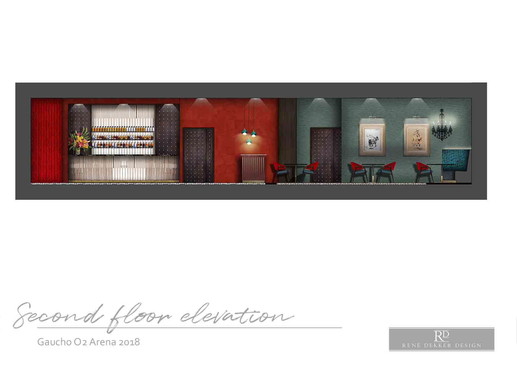
Finally the top floor would be the private members area. In keeping with the iconic black and white cowhide theme that the restaurant is famous for, we took the colours and re-purposed them and then added red. On entering the space there would be a large red circular velvet sofa, emulating the grand hotel feel of South America. Black and white marble would be laid to the entrance and then the main restaurant would have a black and white leopard carpet.


T: +44 20 7036 1699
E: [email protected]![]()
![]()
![]()
![]()
![]()