Colour
It's not an easy one to get right, but the good news is that it's the easiest way to introduce interest to an interior and it’s easy and inexpensive to correct if you get it wrong. Colour sets the mood for a room, and the shade you choose should be about how you want the room to feel and the atmosphere you want to create.
Everyone has a different preference when it comes to paint shades, and some get the choices absolutely right. Others, however, find it more of a challenge. It takes a good visual eye, knowledge of how different hues behave, and clever tricks of the trade to ensure you make the most of a space, its dimensions, architectural features and, of course, light. If you're not confident in doing this, never fear–this is where luxury interior designers come in.
Here are some professional interior design tips on how to make the right colour choices.
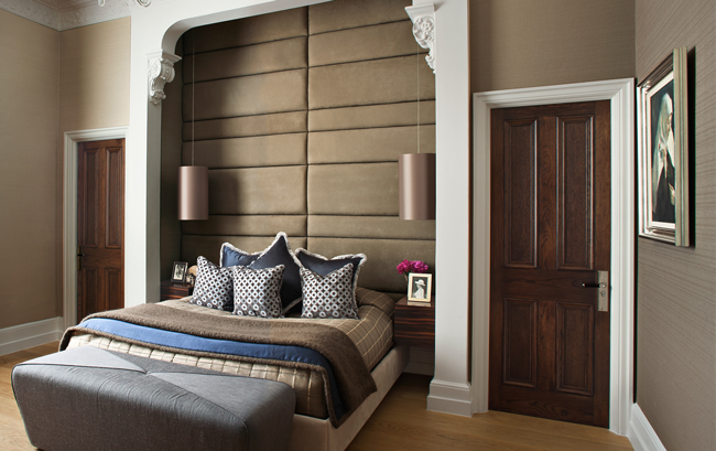
First, think carefully about the period of a property, a room's use, and direction and amount of natural light. Depending on what you want to achieve, the size and dimensions of a room are also important when considering paint colours–brighter, warm tones, such as reds and yellows, will bring the walls or ceiling closer. Conversely, paler, cooler colours (from the blue and green side of the spectrum) will give the illusion of a greater space.
Once you've narrowed down your selection, paint a sample on a few pieces of blank white paper (for consistency) and hang them around the room. Look at them at different times of the day and night to see exactly how they change according to how much light enters the room and to gauge if you're happy with that shade before making a commitment.
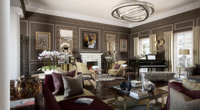
It might be tempting, faced with a blank canvas, to choose strong colours–they can provide a wonderful sense of drama, and bold can certainly be brave–but they can also date quickly. An alternative is to incorporate colour as an accent shade on a single feature wall, niche or even the area behind a bookcase, as this will highlight the inside of the recessed area as well as provide an eye-catching focal point.
Enhancing a room's architectural features such as moulding, mantels, arched doorways, wainscot, windows and doors also offers an opportunity to add another layer of interest. Although white and off-white have been the traditional choice for architectural details, one shade darker than the wall is a contemporary and subtle way of drawing attention. Repeating this in every room will also provide a sense of rhythm and continuity throughout the property.
When it comes to choice of paint brand, the rule of thumb is the more you spend, the better the quality, coverage and finish. Essentially, what you're paying for is pigment, which is what gives paint its quality and depth of colour. Traditional pigments tend to be made of rocks, minerals, earth and clay, and it's the impurities within them that give pigment their complexity–the more complex the pigmentation, the more subtleties of the colour. It's probably why some companies give their paint shades complex (and cheery!) names such as Arsenic, Drab and Dead Salmon.
But if you're in doubt about how to use paint to introduce colour, a luxury interior designer will know exactly what will suit your space as well as your needs and be able to reflect your personality. Not only that, but they'll also be able to steer you through the maze of finishes available (look out for Intelligent Emulsion, for example). Should you still opt for subtle, neutral tones for your walls, look out for our interior design blog that will show you how to inject colour through fabric, furnishings and, of course, impeccably chosen accessories!